
Sparkling Botanicals
Landing Page | Case Study
———————————————————————
Project Overview
The product: As part of Sparkling Botanicals’ new product launch campaign, we designed a landing page experience that drove trial and increased ease of shopping, while educating users about the brand.
Tools: Pen and paper, Miro, and Figma
Partners: I worked with Daybreak Agency on this project.


The problem: The original version of the Sparkling Botanicals website was setup with e-commerce, but the experience wasn’t optimized to drive trial or build awareness of the full portfolio. With a product launch on the horizon and a goal to increase D2C sales and repeat purchase, we were not set up for success.
The goal: Our goal with this landing page was to drive conversions of the sampler pack, introduce the new Blue Tea Jasmine product, and educate shoppers on the range of flavor profiles and botanical ingredients.
My role: UX Designer - Research, Wireframing, Content Strategy, UX Writing
Responsibilities: User research, information architecture, wire framing and content strategy
Empathize
To begin the project, I collaborated with the Sparkling Botanicals marketing team to better understand our core audience for this landing page. With limited time and resources, and using sticky notes and discussion prompts, I facilitated an exploratory empathy workshop with the team to give us clues as to: who are they and what are their desires and pain points?


Pain Point #1
We learned our audience has limited perception of Sparkling Botanicals as a brand, and lack of clarity on the products. This signals our brand awareness and engagement is on the lower end.
Consumers need an introduction to Sparkling Botanicals that helps reinforce the brand identity and value proposition.
Pain Point #2
We learned there’s also lack of awareness about the brands craft-brewed flavors, direct trade sourcing model, and herbal ingredients, which would help drive consumer interest.
Consumers need to be more informed on the deeper layers of the brand, including sourcing, ingredients, and craft-brewed flavors.
Paint Point #3
The existing website homepage was not optimized for mobile usage, and this made it difficult to go through a purchase flow without running into challenges with usability.
Consumers need an easier way to make purchases via their mobile phone, especially as we drive traffic from social media advertising which is primarily consumed on mobile devices.

As part of our competitive audit, we evaluated competitive products to better understand the landscape and themes in the D2C space.
Ideate

Information Architecture
After collecting and synthesizing core insights about our audience, we moved into a content ideation exercise. I led us through an idea-generation sprint, and then we ranked the modules as if they were on the landing page, to help us get a sense of information architecture.
Wireframes
As I moved from the IA and structure state of mind into development lo-fo wireframes, I considered our audience and what I had learned about their needs:
What structure and functionality might bridge the existing gap in brand/portfolio awareness, and also serve to educate about the brand, as we push conversion?
Below are some of my initial lo-fi wireframe sketches in Figma:


After internal workshopping, I made some refinements on the lo-fi frames to better serve our objective and strength key “moments” on the page. Here are the features we elevated and refined:
Flavor-forward product carousel. This interactive moment felt critical to include early in the experience, since we know users care about taste and want to know more about the craft brewed flavors. This immersive, image-forward carousel makes it easy for users to click through the portfolio and take in both informative romance language, along with the ingredients list for each SKU.
Multiple entry points for purchase. Knowing our overarching intent with this webpage is to drive trial of the products (and specifically, the sampler pack), we wanted to ensure there were various ways in for ease of navigation, without the CTAs feeling overwhelming to users. We struck a balance by including a range of CTAs with different emphases - for instance, directing to different products, and reinforcing the value proposition with a more immersive shopping module.
Mobile friendly experience. One of our goals was to have this landing page experience designed with mobile optimization, knowing that the majority of our users will be trafficked here from social media ads, likely from their mobile device. This lens was important to consider as we developed content and design, rather than an afterthought.


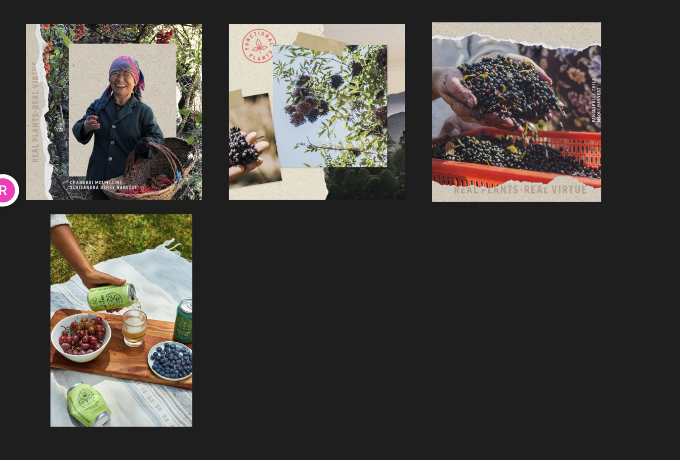
Although we weren’t starting from scratch with Sparkling Botanicals’ visual design system, there was still art direction to be done. Using the brand’s library of assets, I led the content strategy aiming to strike a balance between brand-forward product imagery, with provocative, flavor-forward, imagery that would entice users to convert. Additionally, considering the overall brand-building objective, I wanted to ensure a good representation of more lifestyle-centric and sourcing moments through the creative.


At this stage, I passed off the page structure and art direction to a developer, and collaborated through completion. Check it out for yourself!


TEST
Since launching the landing page, we’ve increased conversions of multi-unit orders including Sampler Packs, just in time for the brand’s busiest season - summer. More performance data to come.