Greenpoint Cycles
Bike Shop App | Case Study
———————————————————————
Project Overview
The product: Greenpoint Cycles is a shopping app for a Brooklyn-based bike shop. It was designed to elevate and humanize the experience of buying a bike, while saving users time, money, and stress.
Tools: Pen and paper, Miro, and Figma

The problem: The process of buying a new bike is often overwhelming and time-consuming, leaving even experienced cyclists with the burden of conducting their own product research, scouring the internet and vetting bike shops, all before negotiating a fair price for their new ride.
The goal: The goal of the Greenpoint Cycles app is to empower users to shop with confidence and a sense of ease via personalized product recommendations from cyclings experts.
My role: UX Designer - Research, Design, & Interaction
Responsibilities: User research, information architecture, wire framing, prototyping, testing, and visual design
Empathize • Define • Ideate • Prototype • Test •
〰️
Empathize • Define • Ideate • Prototype • Test • 〰️
Empathize
The first step in this project was conducting research to understand our users: who are they, and what are their desires and pain points? I conducted both primary and secondary research with interviews and a competitive audit, to better understand these users and their motivations.
My assumption going into the project was that a primary challenge users face when buying a bike is uncertainty about what to be looking for (i.e. style of bike, specs, and other features to consider). I was surprised to learn about the range of challenges that were shared experiences amongst different users:
“Buying used, there’s always the question of: Does this bike need any tuning up? Is it safe?”
“I always feel rushed test-riding on the spot, and there’s an assumption that you’re going to buy it.”
“I don’t exactly know what I want, but I want to be informed in an honest, genuine way.”
Pain points
-
Users, especially those who aren't already experienced, feel anxiety about making a major purchase without having a firm sense of what they should be evaluating and seeking out when they shop.
-
When vetting model options, users felt like they didn't have a trusted source to help guide them in their purchase, that wasn't motivated monetarily - whether it was the salesperson at a bike shop, or a reseller from an internet ad.
-
Users felt strongly they desired a more substantial, realistic test ride with their new (potential) bike, without the underlying pressure of trialing on the spot, either at a bike shop or in front of a reseller from the internet.
-
Whether they are purchasing used from the internet or from a local bike shop, users often felt in the dark about if they were receiving the fair, market-rate price.
Value proposition
To clarify our unique value proposition against competition, I identified all of the product's features and benefits, and then sorted these into themes based on the user’s values. Then, I explored the competitive landscape to identify what elements are truly differentiated for this product — and where opportunity lays.


As part of our competitive audit, I evaluated three cycling brands’ products to help reveal a white space. I discovered an opportunity to make the bike shopping experience more smooth, simple, and personable.
Greenpoint Cycles offers an intimate, personalized bike-shopping experience for cyclists, with trust from experts embedded throughout the process, bringing support and delight to users buying a bike.
DEFINE
Personas
Drawing from the interviews I conducted, I developed two personas that represent different user groups for our product.
Andrew, a commuter cyclist in New York City, needs a solution for navigating the daunting cycling landscape without a lot of background knowledge on bike equipment. Kelly, an experienced distance rider in Northern California, is seeking trusted support and pricing transparency from cycling experts with integrity.
Although both Andrew and Kelly share a love of cycling, they have different behaviors, goals, and challenges that each represent a unique story.


User stories & journeys
Outlining the user’s current experience purchasing a bike and their feelings each step of the way helped reveal opportunities for improvements. Each journey below is grounded in the user’s unique goal, which we outlined in a fictional user story for either persona.
Andrew: As a casual bike rider without a lot of background knowledge on bicycle technicalities, I want to be guided along in the process with a trusted resource I can count on, so that I can find the right used bike for me that suits needs as a commuter and is safe.
Kelly: As a performance cyclist with a solid understanding of the features I want in a bike, my desire is to purchase from a local source I can trust where I know I’m getting a fair rate, so that I feel confident and empowered to continue pushing myself while staying up to date with the latest equipment.


IDEATE
How Might We and Crazy Eights
Informed by our user research, we now transition into the ideation phase, where we use different exercises to identity opportunities for our problem. The goal here is to push ourselves towards a range of solutions by approaching our problem from different angles. The sky is the limit! Here’s a few of the “How might we’s…” that came out of my process:
How might we make the process of shopping for a bike gamified?
How might we highlight the bikes that aren’t the right fit for a user?
How might we digitize the process of shopping for a new bike
How might we simplify the process of shopping for a bike?
How might we empower cyclists in this process?
How might we automate the shopping process for cyclists shopping?
How might we reduce the overwhelm that cyclists feel when they’re shopping for a bike?
How might we offer the opportunity for cyclists to trial bikes before purchasing?

Crazy Eights
Once I had a clear idea of our problem statement, I did a crazy eights exercise to sketch out a lot of ideas quickly. The goal here is to move quickly through eight sketches that provide a range of ideas for possible solutions.
User Flow
At this point, I started to have a better sense of what solutions might be feasible to meet the desires of my users. I learned early on that users are often overwhelmed by the process of purchasing a new bike. My goal with this initial user flow is to remove the burden of user’s having to do a lot of bike research, while also saving time via personalized product recommendations, market price analysis, and the option for users to opt into a free "trial ride" experience with the bike they're considering. If we are successful, users will seamlessly and confidently purchase their new bike from the shop app, and have a positive experience doing so. Here's my flow for this process:

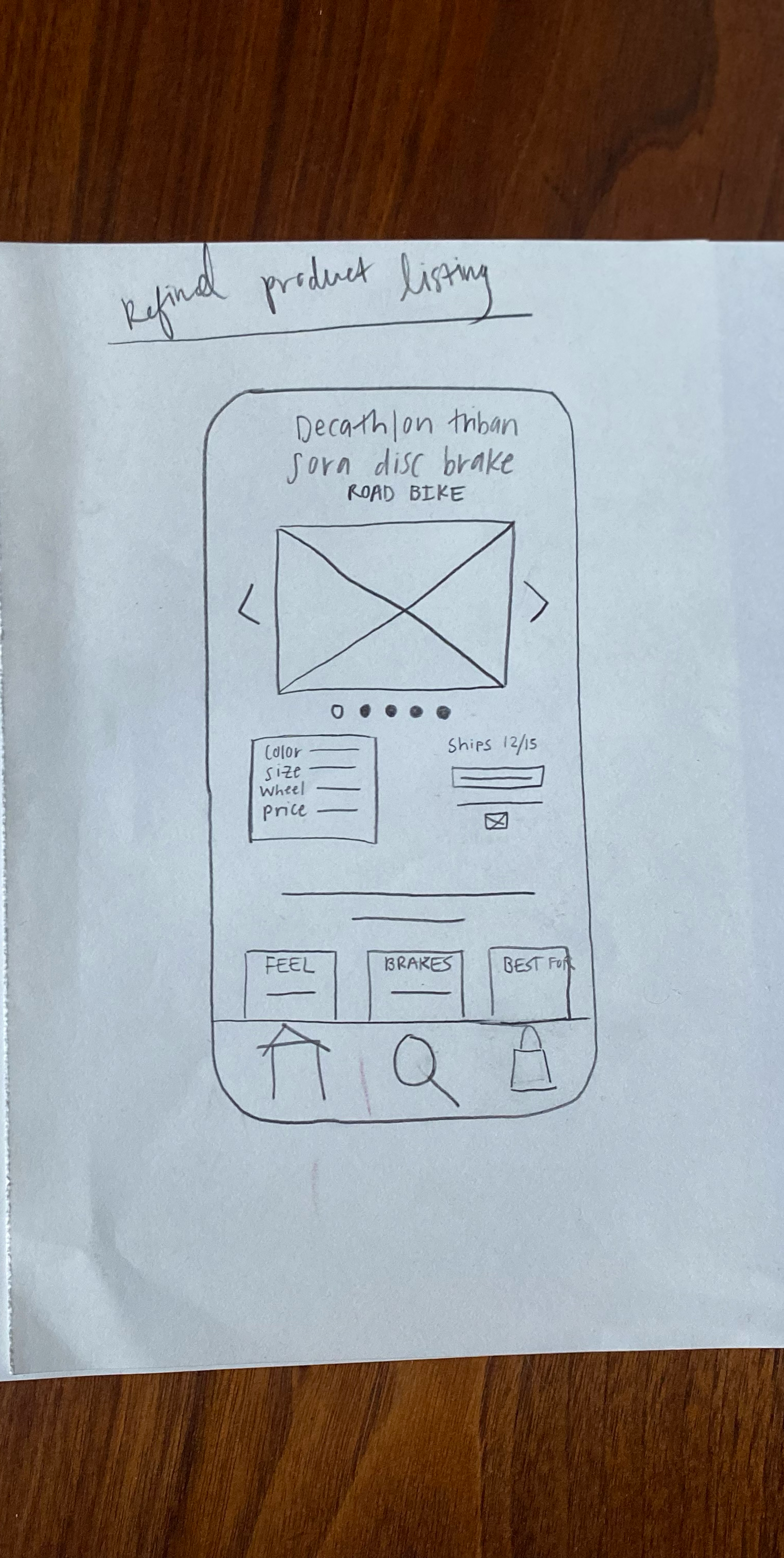
Wireframes
Before getting into paper wire framing, I did an information architecture site map exercise to establish the overall structure of the app and help organize content. From here, moving into paper wireframes allowed me to really hone in on the structure and interaction experience of this app. This format allowed for quick iteration and the ability to catch problems early. Below are several iterations of my bike app’s product page, with the refined wireframe last.


PROTOTYPE
Next, I brought my sketches into Figma to serve as the basis for my lo-fidelity wireframes and eventually, a prototype.
In considering different potential features and functionality for this product, I considered my personas, Andrew and Kelly, and what would best serve their goals of finding a new bike, getting trusted support, and receiving fair rates for their purchase.

Key app features:
The product recommendation quiz helps filter through a crowded marketplace of bikes to make an informed recommendation. Through a series of several questions about cycling preferences and lifestyle, they are served product recommendations that match their needsThe goal of this quiz feature is to remove the burden of users having to shop around and spend hours on research.
Detailed product reviews on specific model features help provide users with a sense of transparency into what they’re purchasing. Reviews are organized by the features we learned in our research are most important considerations when purchasing abike.
Real-time messenger that provides users with support from cycling experts. The "Connect with an expert" messenger adds a dynamic, human touch to the online shopping process, in a familiar chat-feature interface and responses in real-time. Messaging capabilities with text or voice to text depending on the users preference.

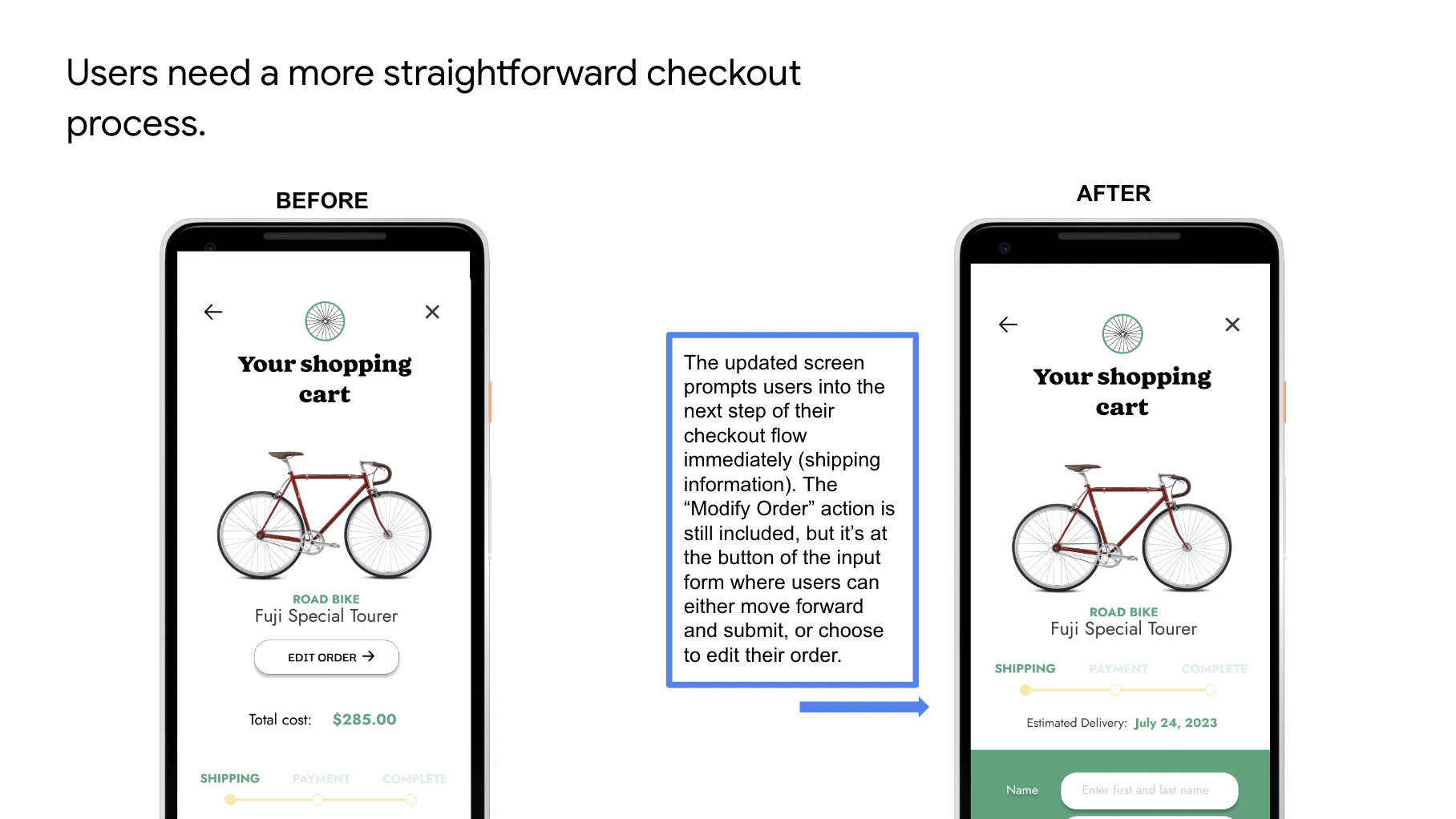
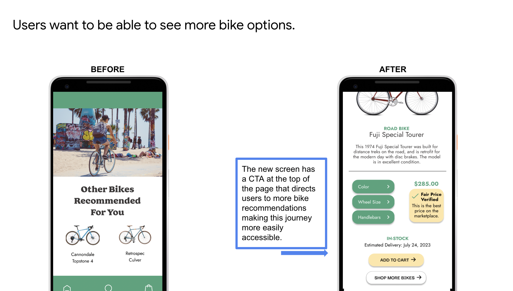
TEST
Before moving on to my high fidelity prototype, I conducted a usability study to understand what challenges users might face in their path to purchase, and generally understand how people navigate within the app. There were three key insights I discovered:


After implementing updates into my lo-fo prototype, I began establishing the design system for the product, which would eventually include the UI patterns and visual styles that would bring a sense of consistency, scale, efficiency, and reinforced brand identity to the app.
Applying this system to my wireframes, I considered what would resonate with the user of this product in a way that would be engaging, accessible, and ultimately serve the goal of simplifying the shopping experience. In considering accessibility, I aimed for high contrast tones and simple, enlarged type styles that would make it easy for users to access.